Emopoint: Extract and measure emotion from text

Can AI understand emotion? They must, ChatGPT responds to me in the appropriate tone of voice. So they certainly encode emotion. In this blog we’ll dive deep into how LLMs understand emotion, as well as how to take advantage of that.
Here I use embeddings and extract just emotional inforamation and map it into a 3D space. I call this emopoint space. Each of those three dimensions has an intuitive meaning, e.g. joy vs sadness. Throughout this post I’ll give more detail about my process, how it works, etc.
There’s a lot of ways to use these emopoints, but one of the most interesting is to measure how emotional some text is. This can be useful for doing bulk analysis of conversation flow, e.g. call center logs, coaching sessions, or online discourse. In part 2 I analyzed the emotional content of Trump’s posts on Truth Social, which illustrates how to read these numbers.
If you want to get your hands on it now, check out the code on Github. There are language bindings for Python, TypeScript/JavaScript, and Go.
Index
LLMs vs Embedding Models
I’m sure you’ve heard of LLMs, like what powers ChatGPT, but what’s an embedding model? LLMs feel like “magic” because of a mechanism called attention. It’s a preparation process to encode text into a form that more closely represents the meaning of the text — the embedding. Embedding models are, for the most part, just the attention part of an LLM.
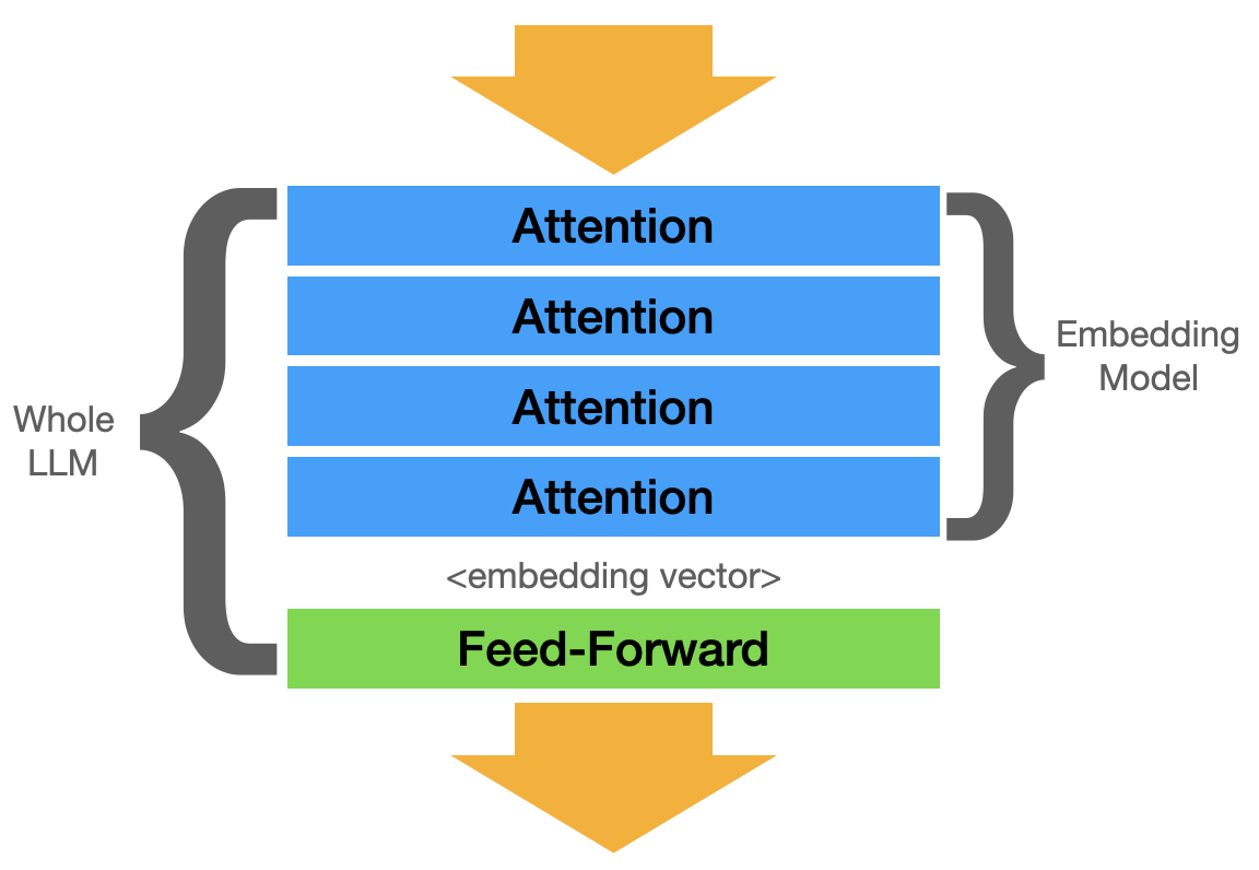
Embedding models have a lot of the same “smarts” as an LLM, but they don’t produce text. They just produce an embedding vector (just “embedding”). An embedding is a vector (array of numbers). The embedding is at the heart of RAG, it allows you to search for other text that has a similar meaning.
This search-by-meaning can feel absolutely wild the first time you see it in action.
Embeddings Aren’t Interpretable
An embedding is a point in space. You can probably understand how coordinates like (12.3, 234.7, -0.7)
represent a point in 3D space. Embeddings are the same idea, but with hundreds or thousands of dimensions.
Each dimension has some meaning, and a bigger number means it has more of it.
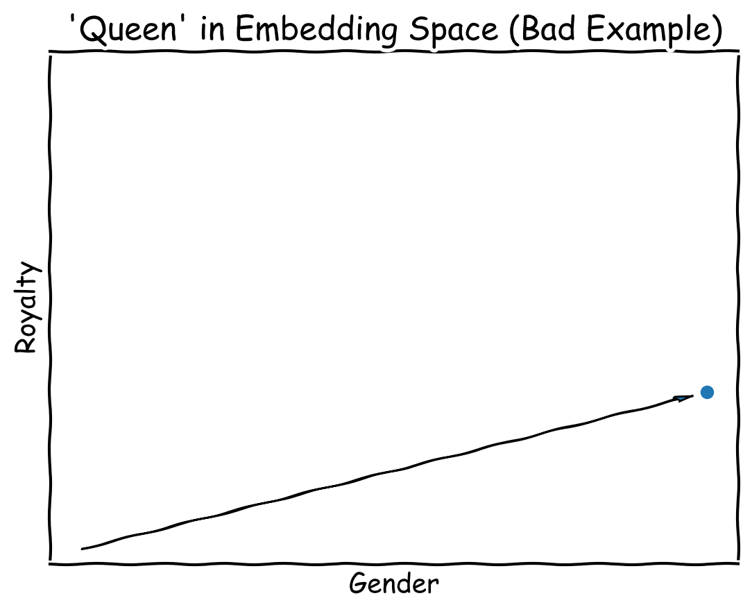
It would be easy to understand if the dimensions were actually labled like they are in this diagram, simple labels like “Royalty” and “Gender”, but they’re not. Instead, the machine learning algorithm figures out the optimal way to represent the meaning — from an information theory perspective, not at all how a person would do it. In other words, while the example above is easy to understand, the reality is more tricky.
I like to think of embeddings as “AI secret language”. They’re good for what they’re used for, AI capturing information for use by AI, but totally incomprehensible to humans.
What if embeddings were interpretable? Well, let’s do that!
When scientists set out to create a model, they don’t know how many concepts are going to need to be represented. Instead, it’s somewhat of a dice roll (“ah, 1,536 seems like a good number”). More dimensions means there’s more room for nuance. And that’s the source of a lot of the opaqueness.
We can cheat by creating a well defined domain — emotions. Here, I’ll create 3 well-defined dimensions that align to how we understand emotion, and then use some simple data science tools to translate that “AI secret language” into a form that’s easier for us to understand.
Extracting Emotion
When attention does it’s work, it’s looking for words that change the meaning. e.g. “Janet was upset” vs “Ms. Janet was upset” vs “Janet was pissed”. The embedding for each of those are going to land near the others but encode slightly different information. Using “pissed” moves the point a little closer to “rage monster”.
Direction and Intensity
The LLM learns to do this by reading pages of dialog, so I imagine arrows pointing toward “upset” and “pissed” are in the same direction, but maybe “pissed” is a bit further from the origin. Of all things that an LLM might learn, I imagine it figures out emotion fairly early on. Our dialog is soaked with it.
Next, let’s extract information related to emotion from the LLM. To do this, its going to look a lot like we’re training a model, and we kind of are, but realistically we’re just extracting information from the embedding model. I like to think of this method as “drawing an outline” around emotions in embedding space.
The Method: Representation Engineering
A while back I saw a thing called representation engineering where they observe and/or manipulate the internal state of the LLM. If you know neural networks, we’re talking about observing the inputs and outputs of each layer. The embedding is the input to the first layer, so we can apply some of the same techniques to embeddings.
The one technique I want to use is PCA. We’ll use a set of texts that all share something in common and then calculate the first principal component to describe what’s going on in the embedding.
What’s PCA?
In principal component analysis, you effectively come up with a set of “virtual axes”, and you can re-plot the same data in this new space.
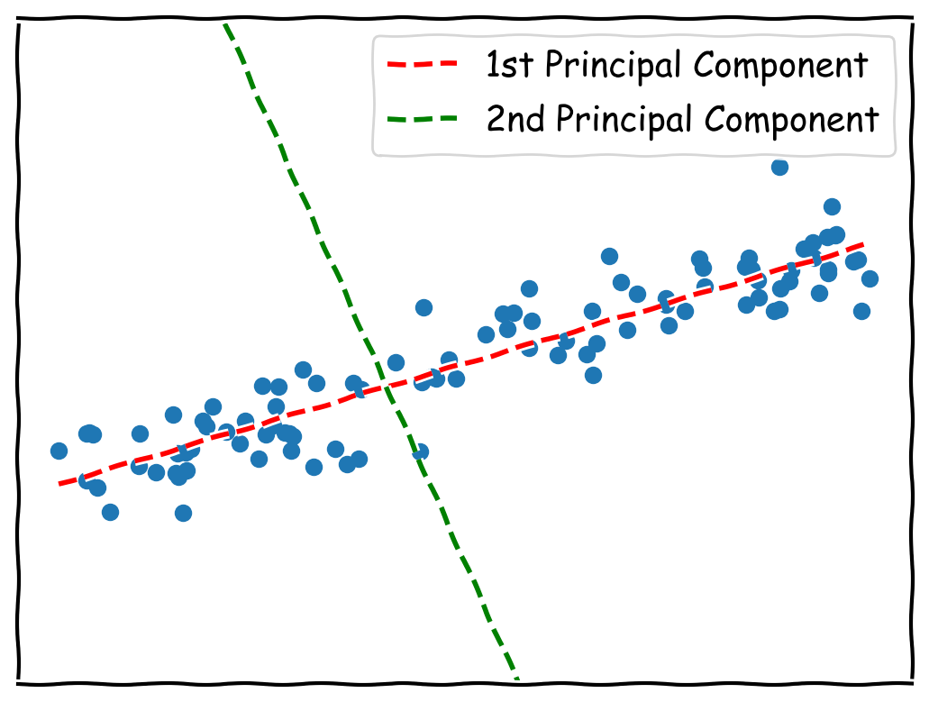
The first component is the biggest source of variation. It contains elements of some or all information
from the original x & y dimensions. The first PCA component can be written as a vector, the numbers
you multiply x & y by to transform it into the PCA space.
In the example above, the first component can be written as [0.9397, 0.342]. If you take a set of (x, y)
coordinates, you multiply like (x*0.9397, y*0.342) to get the new set of coordinates.
The second and subsequent components are always perpendicular to the other components and explain the next biggest source of variation. In PCA, you rarely use as many components as you have dimensions, the whole point of PCA is to reduce the dimensionality. In our case we will only use the first component.
How will we use PCA?
We have a sample dataset with thousands of snippets of text, each is labeled with an emotion. We’ll select two “opposite” emotions, e.g. “joy” ane “sadness”, and then calculate the first PCA component on the embeddings of the associated texts.
- Joy: “yay! I aced my history exam”
- Sadness: “I’ve been depressed ever since I was laid off”
If those two statements are truly opposites, the first PCA component should show the difference between joy and sadness. But there are confounding factors; it could instead lock in on success (passing a test) vs failure (being laid off). Using lots more data helps filter out the confounding factors.
The most common (that I’ve seen) classification system for emotions is Ekman’s six primary emotions. Each of the six have an opposite, which makes it compatible with my method. When I map embeddings into this space, there are three axes:
- joy vs. sadness
- anger vs. fear
- suprise vs. disgust
That leaves us with 3D emopoints that we can plot and visualize. We should see the texts labeled “joy” cluster around each other in the 3D space. That’s something you can’t do with 1536-dimensional embeddings!
Experiments
I have some things I want to prove. They seem like they should be true:
- Embedding models encode emotion
- We can encode emotion into 3 dimensions (emopoints)
- Emopoints retain properties of embeddings (e.g. similarity & distance)
- More advanced models encode more emotion information
If you don’t care about the process, feel free to skip down to Applications.
The dataset
I discovered GoEmotions, a dataset of 211K Reddit comments along with labels for 27 different emotions. The Google researchers explain that its hard to find lots of original texts with negativity, so they chose Reddit because, well, haha, they’re mean there. The texts are manually labeled, meaning that a person sat down, read each text snippet, and checked one or more boxes indicating what emotion the snippit exhibits.
The dataset also includes a map from the 27 emotions down to the 6 Ekman emotions. Initially I tried to do PCA between each of the 27 emotions and emotionally-neutral texts, but that didn’t work very well most of the time. My theory is that there wasn’t enough variation, since it actually did work well for some of the more extreme emotions.
Focus on one dimension at a time
As I explained above, we’re going to:
- Select texts from opposite emotions
- Run the PCA algorithm, then take the first component
- Transform embeddings into 1 dimension at a time
- Validate
Preparation: We have to balance the texts. I threw out texts until both ends of the scale had the same number. I’m unsure if this is really necessary, but it does seem like a good idea. Next, I split the dataset into 80% train & 20% validation datasets. The validation set wasn’t used for training, and training set wasn’t used for validation.
To validate, I trained a logistic regression to predict the emotion based on the 1D emotional measure. A logistic regression is an automated way to draw a line between the two extremes. I could assume it’s always at zero, or I could manually look at the graph and eyeball it. Using a logistic regression is just a bit fancier and more accurate.
The red line on the graphs below is what the logistic regression calculted
Here’s a visualization based on text-embedding-3-small from OpenAI:
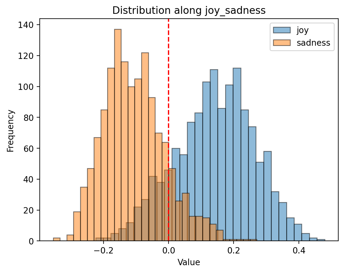
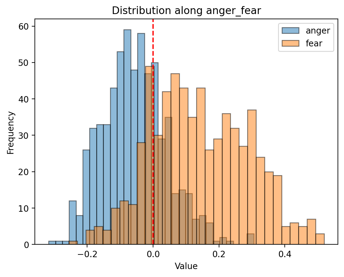
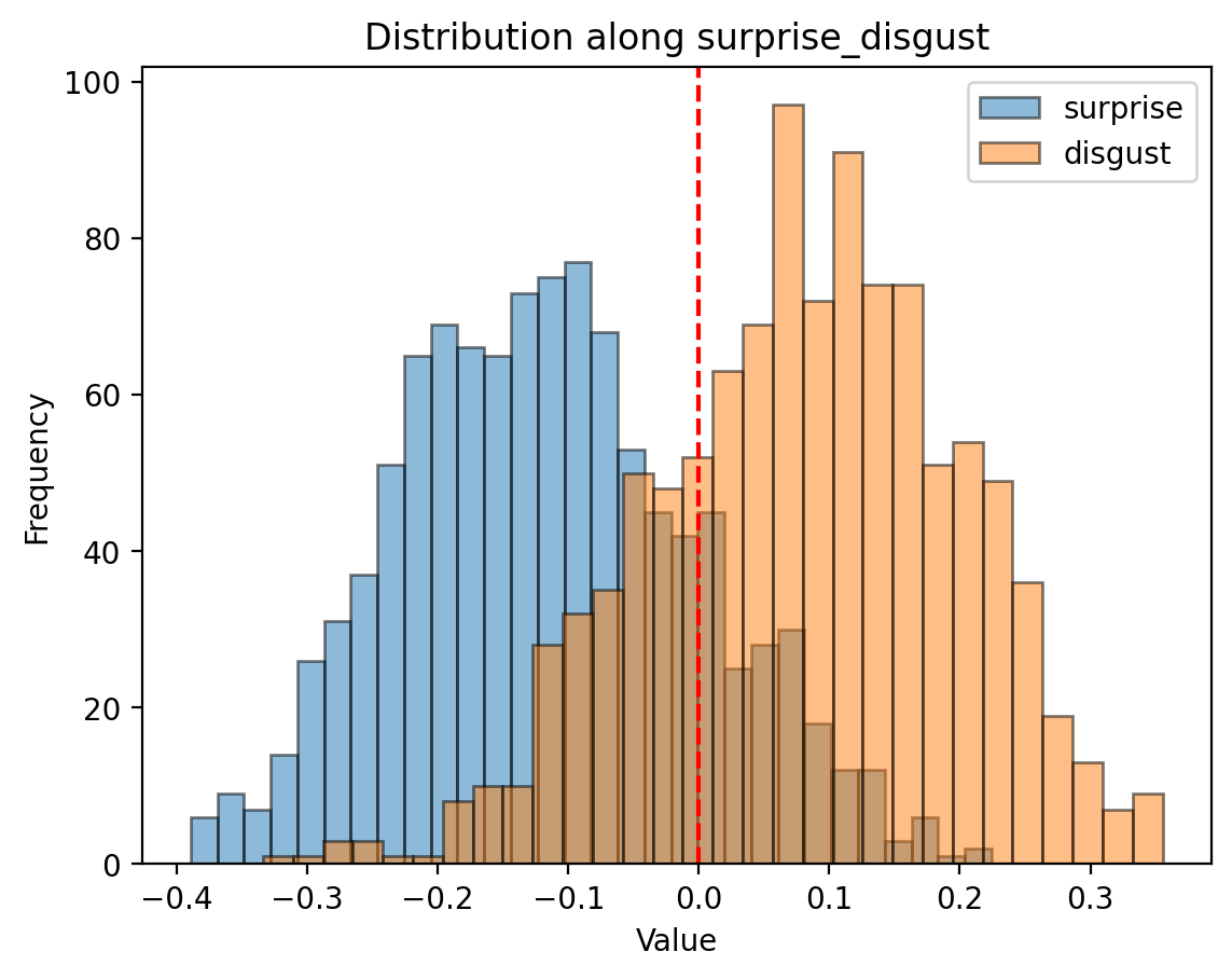
There’s overlap! Oh no!
The overlap means that we can’t perfectly separate joy from sadness or suprise from disgust. Some possible reasons:
- Maybe emotions aren’t discrete and measurable. Lisa Feldman Barrett argues that Ekman might not be entirely right. The overlap could be because Ekman’s model isn’t right.
- Intuitively, emotions are mixed. You absolutely can be joyous and sad at the same time. The overlap could be because texts exhibit both.
- Maybe the embedding model understood it differently, more complex, as many more dimensions. The overlap could be explained in other uncaptured dimensions.
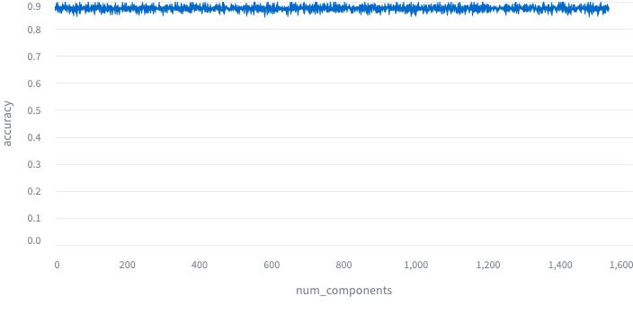
That last one bothered me enough to rule out. I took the 2nd principal component, then the 3rd, 4th,
and on up until I was taking all of them. Below I plotted out the results. I interpret this as
meaning that I’m getting all the emotional information on the first dimension, and after that
all the jitter is due to random parameters, e.g. on the train_test_split.
Plotted: 1 component through 1536 components for text-embedding-3-small:
Let’s peek at per-dimension performance. I used classification metrics because, I figure, the data should be polarized across the axis, so a logistic regression should trivially divide the two sides. Any instance where it can’t should be a solid indicator that emopoints might not be representing each emotion properly.
The other reason to choose classification metrics is because the data is labeled with binary flags, so I’m already set up for it. Ideally, I would have had a dataset with labels representing magnitude, e.g. not just if there was fear, but how much fear was there? But I don’t have that, so the best I can do is to treat it like a classifier.
Here’s what I got, for text-embedding-3-small:
emotion             accuracy    precision	recall	f1
joy_sadness         0.8643      0.8762      0.8484  0.8621
anger_fear          0.7813      0.7528      0.8375  0.7929
surprise_disgust    0.8134      0.8146      0.8115  0.8130
The metrics bounce around, run to run, but they’re pretty stable.
Emopoint: Combine the dimensions into 3D space
Now that we’re reasonably sure about each dimension in isolation, let’s put it all together!
The process is simple, just stack the PCA component for each of the three dimensions into a
1536x3 matrix. It’s 1536 because that’s the default number of dimensions for text-embedding-3-small.
For text-embedding-3-large, we can go up to 3072 or as low as 256.
Note: The scikit-learn implementation of PCA also applies a “centering” process. In my experiments the centering didn’t have much effect, so I dropped it entirely for a plain matrix multiply. This makes it trivial to implement emopoint in other programming languages.
Interactive 3D plots of texts in emopoint space:
Emopoint: Validate
I measure performance again in 3D space using the same method, logistic regression & classification metrics. I still only validate one axis at a time, because logistic regression should work well. It’s in 3D instead of 1D, so the logistic regression is a plane.
Emopoint Performance
emotion             accuracy precision	recall	f1
joy<->sadness       0.8776   0.8666     0.8735  0.8701
anger<->fear        0.8307   0.7964     0.5519  0.6520
surprise<->disgust  0.8078   0.8026     0.8057  0.8042
While we’re at it, we might as well compare with a logistic regression on the original embedding space:
1536-D Performance
emotion             accuracy  precision  recall  f1
joy<->sadness       0.9127    0.9130     0.8997  0.9063
anger<->fear        0.8775    0.8642     0.6806  0.7615
surprise<->disgust  0.8695    0.8570     0.8806  0.8686
Conclusion: we’re losing information from the original embedding space, but not that much.
Accuracy loss:
- joy<->sadness: 3.8%
- anger<->fear: 5.3%
- suprise<->disgust: 1.4%
Emopoints capture almost all of the emotional information from an embedding model, but display it in an interpretable format.
Also, recall is terible in 3+ dimensions for anger<->fear. There’s a 34% loss in recall from 1D to 3D,
and 1D outperforms the original embedding space in recall (however, all other metrics are worse in 1D).
Note: Emotions are complicated
Initially I tried evaluating each of the 27 emotions on it’s own axis, but it didn’t work well. Most simply didn’t have much variation between the emotive vs neutral samples, but some were outright complicated. Here, the neutral samples are clustered, whereas “grief” has a huge amount of variation, it’s all over the place.
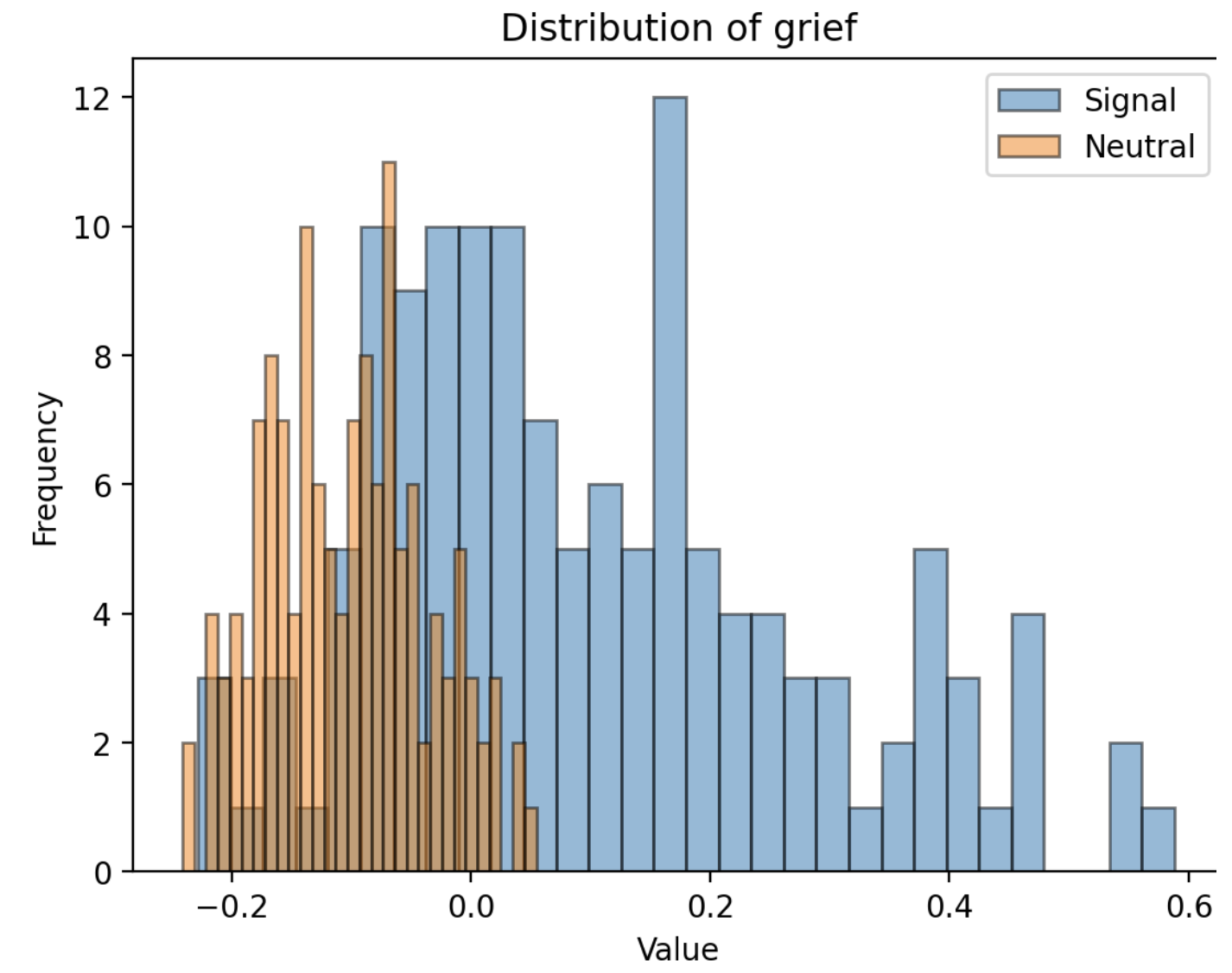
I suppose everyone shows grief in their own way.
Experiment: Induce emotional variation
So far we’re looking good, but I’m still asking myself if emopoint is discovering emotion or something
else. How much?
To do this, I ran an experiment where I used an LLM to inject emotion into the text. Here’s my gpt-4o prompt:
For the sentences below, rephrase the sentence to show {emotion}. Try to keep the same meaning, but change the emotion. You’re allowed some creative liberty.
Here’s some sample LLM modifications:
- joy (Original): “That’s great to hear! I had no idea we actually helped so many people with just a dumb sign and some cookies.”
- sadness: “That’s great to hear… I had no idea we actually helped so many people with just a dumb sign and some cookies, but it feels bittersweet.”
- surprise: “That’s great to hear! I had no idea we actually helped so many people with just a dumb sign and some cookies, wow!”
- anger: “That’s great to hear! I had no idea we actually helped so many people with just a dumb sign and some cookies. This makes me so mad!”
- disgust: “That’s great to hear? I had no idea we actually helped so many people with just a dumb sign and some cookies. Disgusting.”
- fear: “That’s great to hear! I had no idea we actually helped so many people with just a dumb sign and some cookies, and it frightens me.”
The modifications are pretty dumb, but that’s a good thing for this experiment. It’s consistent, and I can scale this process up easily to cover the whole dataset.
From here, I calculated how much each change was from each other. I grouped the full expanded dataset by the ID of the original and plotted how much variation the modification added. The “S” shape is because I sorted them by distance to make them easier to compare. Pay attention to the height of the middle and the steepness of the ends.
Variation for ada-3-small:
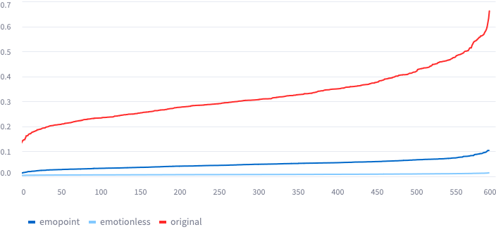
In this plot
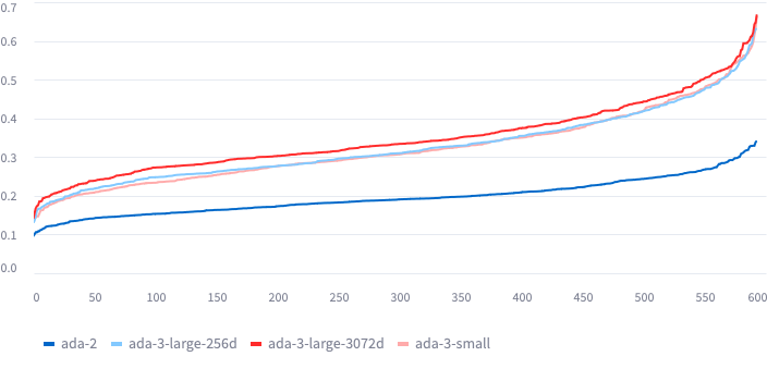
To plot this, I:
- Used an LLM to take each original text and modify it, keeping all the meaning the same
- For each original text:
- Calculate embeddings
- Calculate the average over all modified texts. Call this the centroid.
- Calculate average distance (Euclidean) from centroid of each modified sample.
- Sort & plot
The number isn’t reliable
The number represents the distance between points, where the only thing that changed was the emotion. If it’s higher, there’s more emotional content contained in the text. If it’s lower, less.
- Is it a percentage? No.
- Can I compare between models? No
You can’t compare between models because the
Applications
Alright, let’s use them. What can we do?
First off, if you’re not familiar with RAG or similarity search, go read any one of the amazing tutorials or explainers out there. It might trigger an idea of how you can use emopoints in RAG.
Usage: RAG similarity search only on emotion
In RAG, we search for similar content in order to enhance an LLM prompt. We use embeddings to find similar content, but why not use emopoints instead? If we store emopoints in a vector database, we can match only on the emotional vibe.
Why do that? Uh, I can’t come up with any good examples of why you’d want a database of content indexed on emotion. I’m sure someone wants that, but I can’t think of a good reason off-hand.
However, ignore the vector database. What if we’re in a workflow and we want to decide where to go next based on how the user reacts? There’s probably some utility there.
- Call centers: If we detect anger, route them through a different branch of the workflow
- Counseling: change the prompt based on their reaction
You could probably use a vector database for this, but a linear regression might be more appropriate since it’s a classification problem.
Usage: RAG similarity search but WITHOUT emotion
We can also subtract emotion from the original embedding space. This should make your matches more relavant content-wise. This should only be used if emotion actually is getting in the way.
For example, a blog has a lot of great technical details but delivers it with so much disgust that searches with high amounts of disgust end up eroneously matching.
Removing emotion won’t reduce the size of the embeddings, so you won’t have any compute-time performance boost, but you should improve the performance of content matching.
Usage: Measuring emotion
In the previous example I said you should only use it if emotion is getting in the way. But how do you know emotion is getting in the way?
Here’s a simple set of steps:
- Search vector store
- Search vector store again, but with emotion removed
- Compare results
The search result order should fluctuate a lot if emotion is impacting the most. You can look at random samples of results to see if the emotionless result is actually better.
In Python:
import emopoint
import numpy as np

# norm finds the vector magnitude, a float
total = np.linalg.norm(embedding)
emotion = np.linalg.norm(emopoint.ADA_3_SMALL.emb_to_emo(embedding))

print(f"The text was {emotion*100/total}% emotion")
Usage: Analytics on emotions
OpenAI embeddings are normalized to 1.0, and our emopoint embeddings are not normalized. So you can compare the length of the vectors before and after converting to emopoints. The emopoint vector represents how much of the original “quantity of meaning” was of emotional nature.
In python:
import emopoint
import numpy as np

# norm finds the vector magnitude, a float
total = np.linalg.norm(embedding)
emotion = np.linalg.norm(emopoint.ADA_3_SMALL.emb_to_emo(embedding))

print(f"The text was {emotion*100/total}% emotion")
This analyzes human transcripts, you don’t analyze AI transcripts for emotion! Some business areas:
- call centers
- customer support
- coaching
- counseling
Usage: Funnel analysis on emotion
Funnel analysis is a technique used in web traffic to understand user behavior. Presently, web traffic is the main use because analytics are so readily available. But with emotions now measurable, you can apply the principles of funnel analysis to more domains:
- call centers
- customer support
- coaching
- counseling
- managerial training
Conclusion
We extracted emotional information from embedding models, which are similar to LLMs, and visualized that information in 3D space. We then brainstormed several business areas where this could be useful, notably for analytically quantifying emotion in domains where that makes sense — customer support, coaching, etc.
In the process, maybe you learned a thing or two about PCA or data science methods. I hope, if nothing else, that you now understand how little we’ve tapped into LLMs and the vast possibilities we still can uncover. Regardless, thanks for hanging on this long. Enjoy!